Corbin Fisher Site Redesign 2020: Slick. Snappy. Streamlined.

Corbin Fisher 2020: Slick Site Redesign

Corbin Fisher 2020: Slick Site Redesign

Corbin Fisher 2020: Slick Site Redesign

Corbin Fisher 2020: Slick Site Redesign

If you are enthusiastically inclined to check out CorbinFisher.com (anticipating Donovan’s return) as frequently as we are, then you’ve probably noticed some meaningful changes to the site.

Today, we will quickly outline a few of the more notable changes.

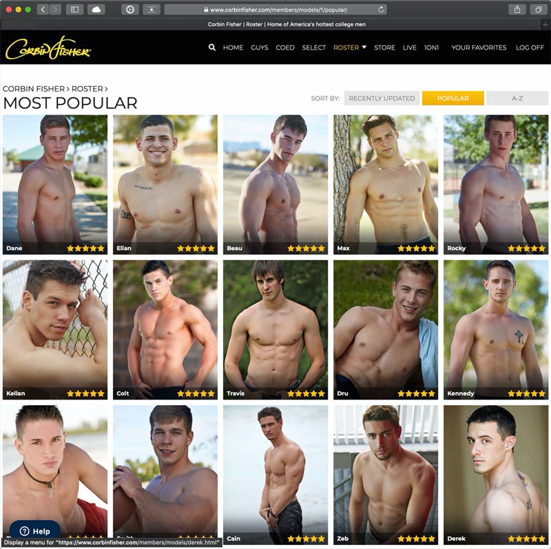
Long gone are the awkward ajax sliders and pre-loaders from 2 versions ago. You’ll now find a clean, glossy tube-style preview layout that allows for autoplay video previews when you hover your mouse above a selection (or touch the thumbnails on mobile). This will enable you to catch a quick glimpse of what you can expect before committing to a decisive click.

Corbin Fisher has also implemented a snappier CDN (Content Delivery Network) to deliver video and image files MUCH quicker than in versions past.

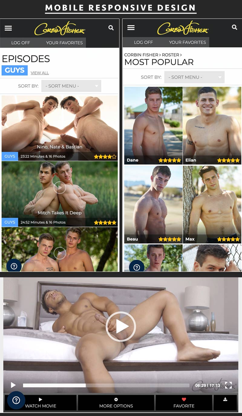
A cursory perusal of this new site redesign yields a positive experience. We like the flat design style with a subtle use of gradients. Finally, the well-balanced use of mobile & desktop responsiveness is efficient and legible no matter your screen dimensions.

Check out the redesign for yourself and then feel free to let CF know what you think in the comments below.

Visit Corbin Fisher

Dman11301989 says:

The format changes are the last thing cf needs. They need to do a overhaul of management and get rid of Jason.

Cubankid says:

!!!!

Positive Vibes says:

Did you notice they also got rid of the upload dates? Fuck, this shit is awful.

moondoggy says:

And step two should be to redesign the SET. I would love to see much brighter walls, or even much darker if I could trust them to light the actors fully. Both can be stark and beautiful, more beautiful than CF’s conventional muddy color scheme.

https://men4menlive.net/blog/wp-content/uploads/corbin_1x.gif
https://uploads.disquscdn.com/images/beff5ed364b1d9cb58d6b0212fe432641a7f21f97f586b0a6fa123b4d55b96a9.png

Positive Vibes says:

Um…NO. It’s large, messy and all over the damn place. I had to click the “enroll” button just to log in, contrary to what the picture described, there is no visible place to log in. Why do webmasters constantly feel the need to re-design? With the old design, you could see all of a models scenes on one page, sorted by time. Now it’s multiple pages for models that did lots of scenes with no apparent order to them. TRAINWRECK!

gaypornfanuk says:

It’s not the layout of the site that needs changing. They are still stuck in the same ‘formula’ of business that they started the site with 15 years ago or so (which was already pretty heteronormative back then). Thing is, the world has changed, people have changed, gay rights and gay pride have evolved (thankfully). If you’re unwilling to evolve with the world, the only fate you can expect is to fall into oblivion.

david david says:

If you are enthusiastically inclined to check out CorbinFisher.com (anticipating Donovan’s return) as frequently as we are, then you’ve probably noticed some meaningful changes to the site.

Gurl… Stop using Donovan as bait and just get the man back ASAP!

All that redesign yet the download speed is still just as bad as before. Tsk… I did like the new design though. It’s very… fancy. But I’m side-eyeing the hocus pocus done on the scene ratings.